DIGITAL PRODUCT DESIGN • TEMPLATE SYSTEM • UX ARCHITECTURE
Designed for Flothemes (Squaremuse)
SYSTEM PRINCIPLES
Modular block logic
Reusable layout patterns
Structured content hierarchy
Scalable blog & commerce integration
Cross-template consistency
CLIENT
Flothemes (Squaremuse)
ROLE
Visual & Template Designer
SCOPE
Digital Product Design
Design System Development
Template Architecture
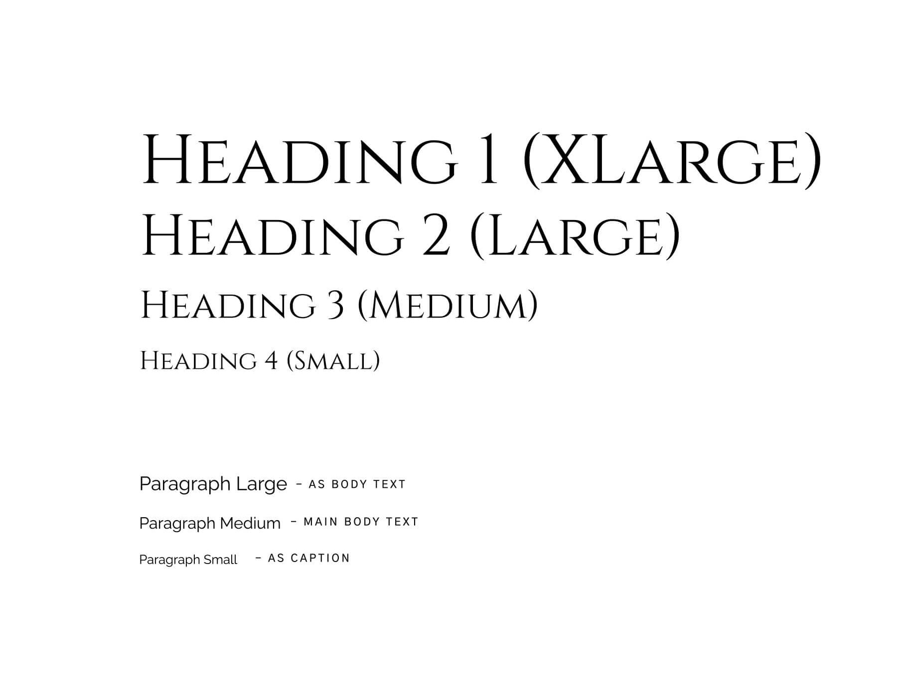
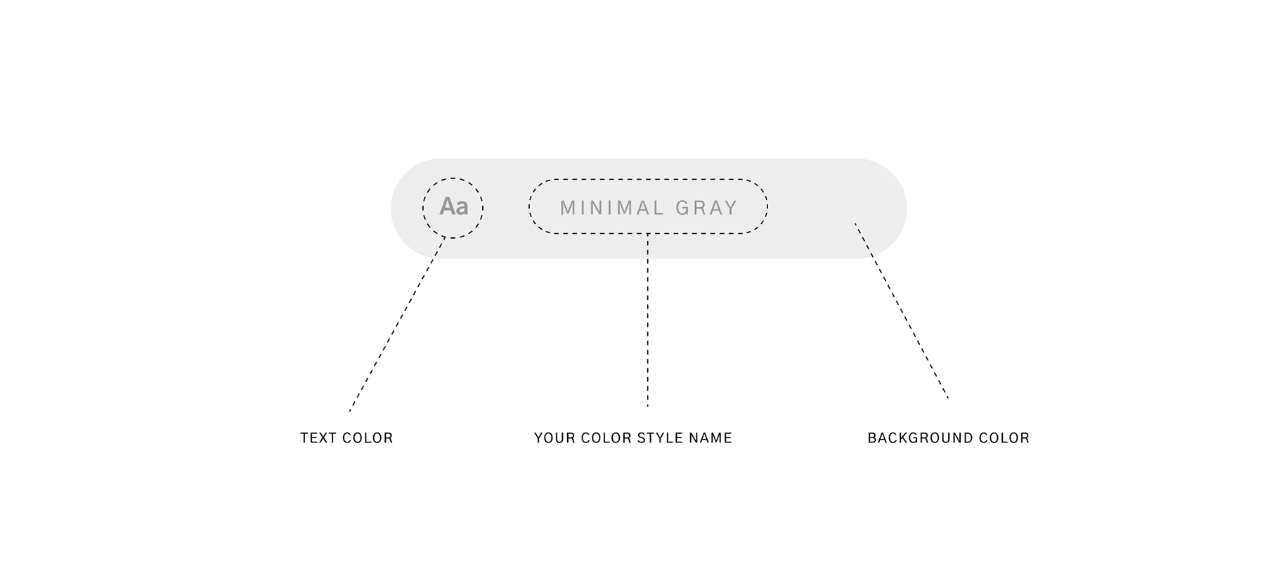
Squarespace Typography & Color System
UX Structure
STRUCTURE
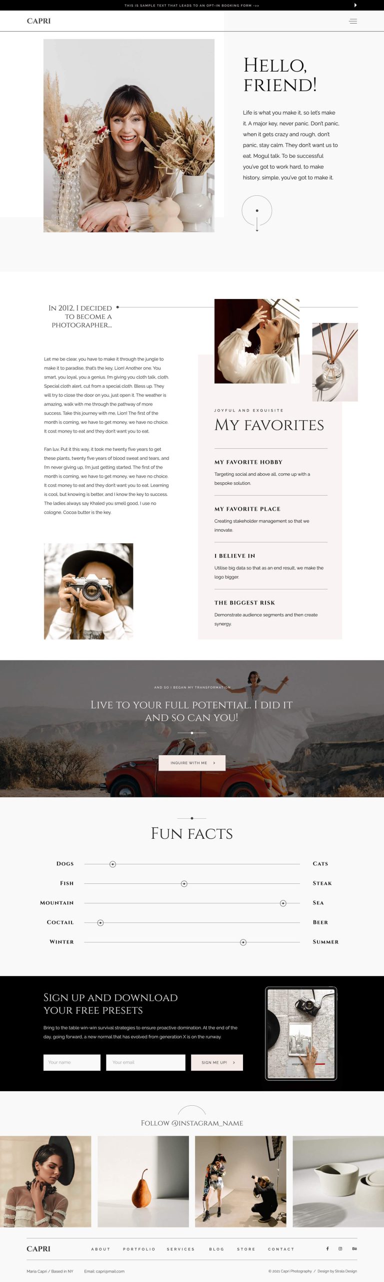
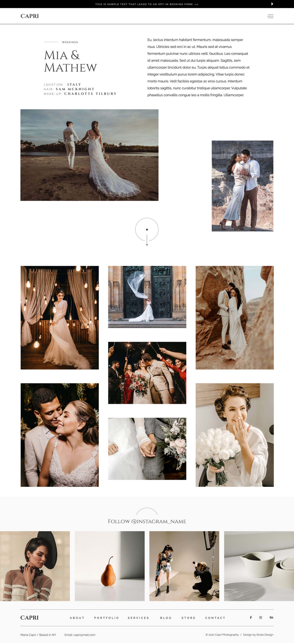
Squaremuse aimed to expand its Squarespace offering with a refined editorial-style template for photographers.
The challenge was to create a modular system that balances visual storytelling, structured hierarchy and flexibility — while operating within Squarespace limitations.
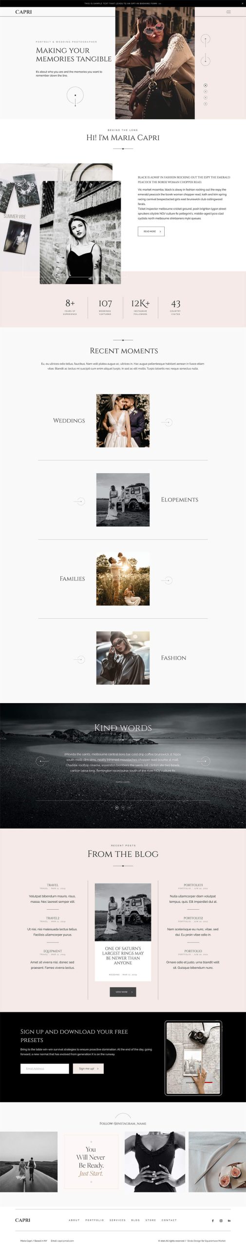
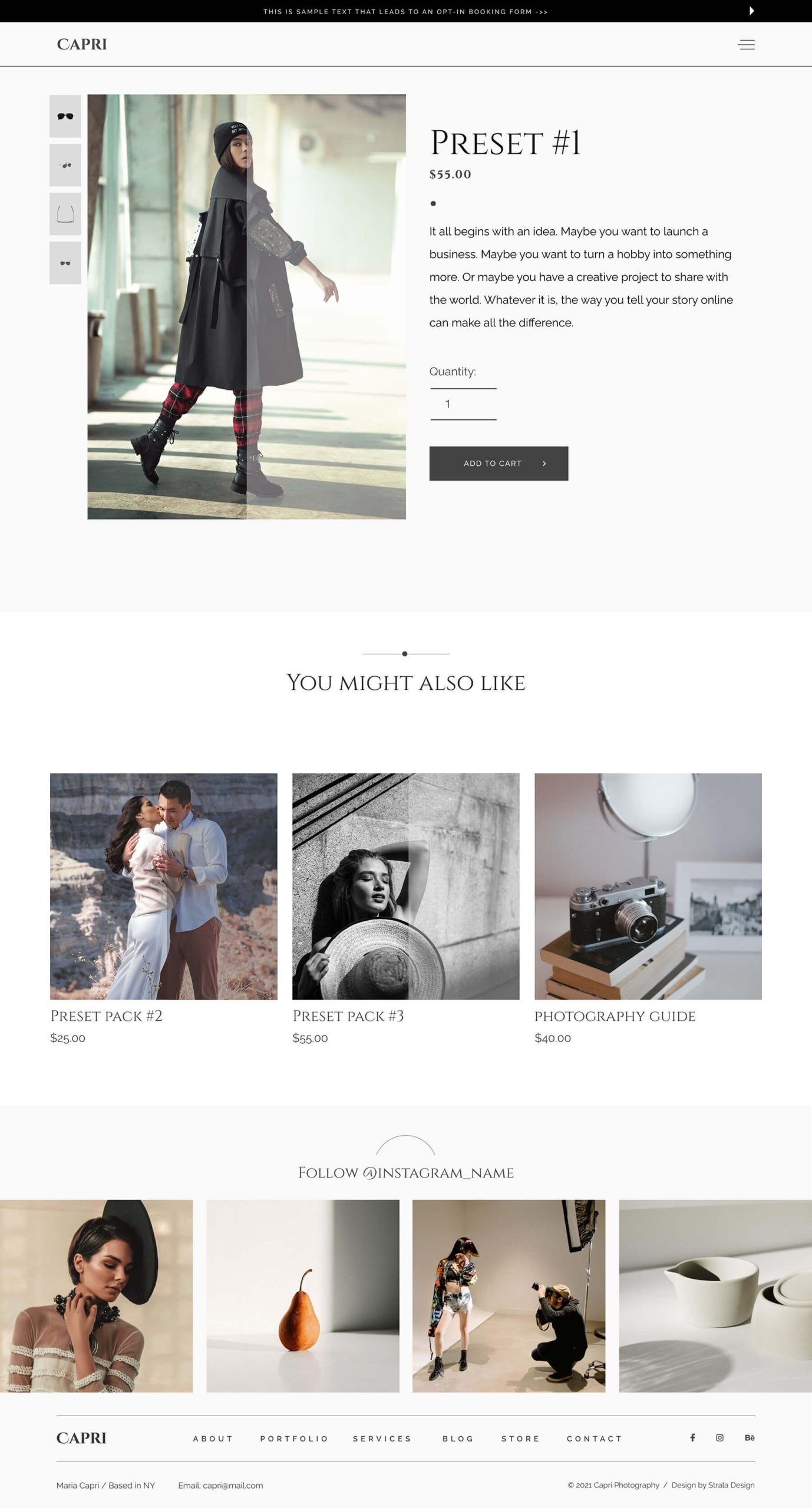
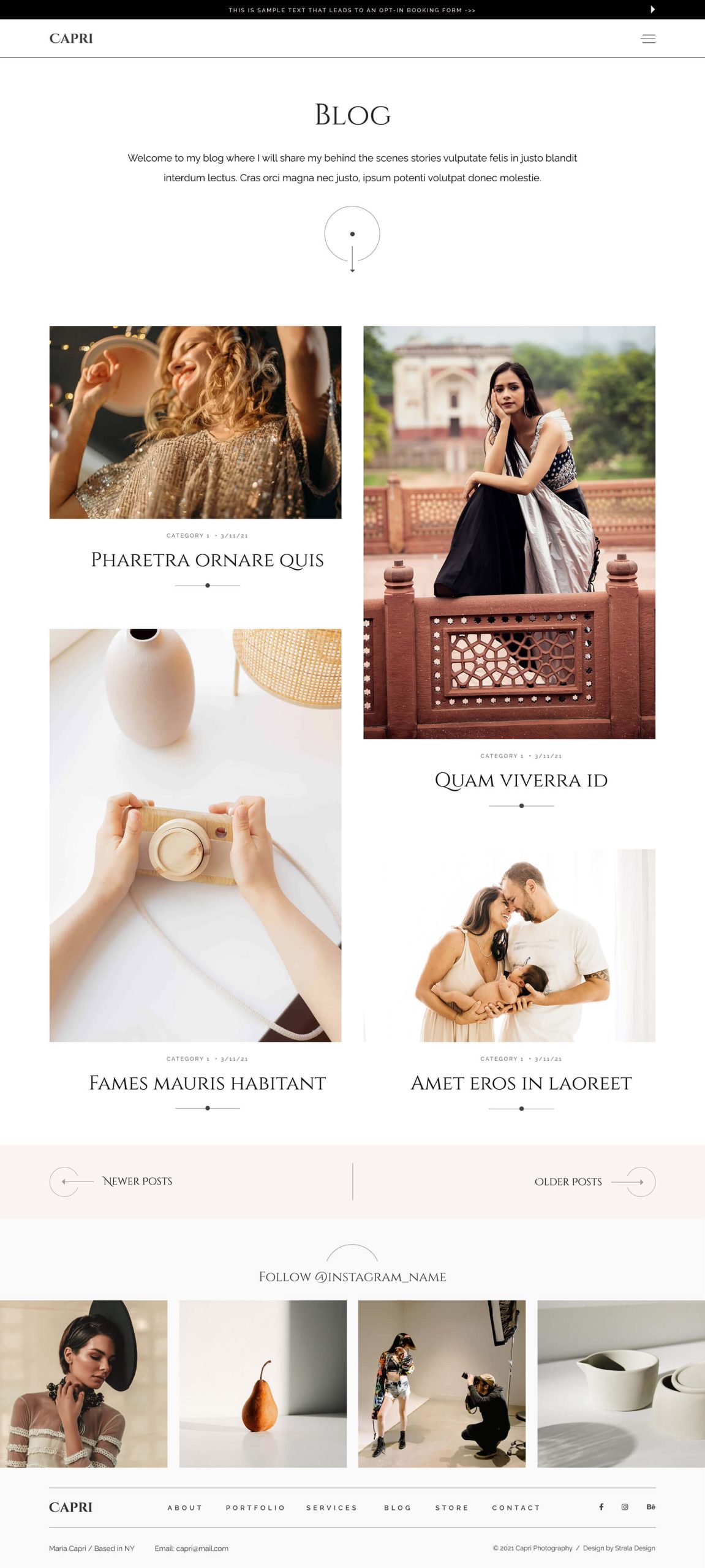
Content architecture was organised into modular layers — brand, portfolio, commerce and editorial — allowing flexible expansion without structural redesign.
Modular UX framework designed for scalable digital publishing.
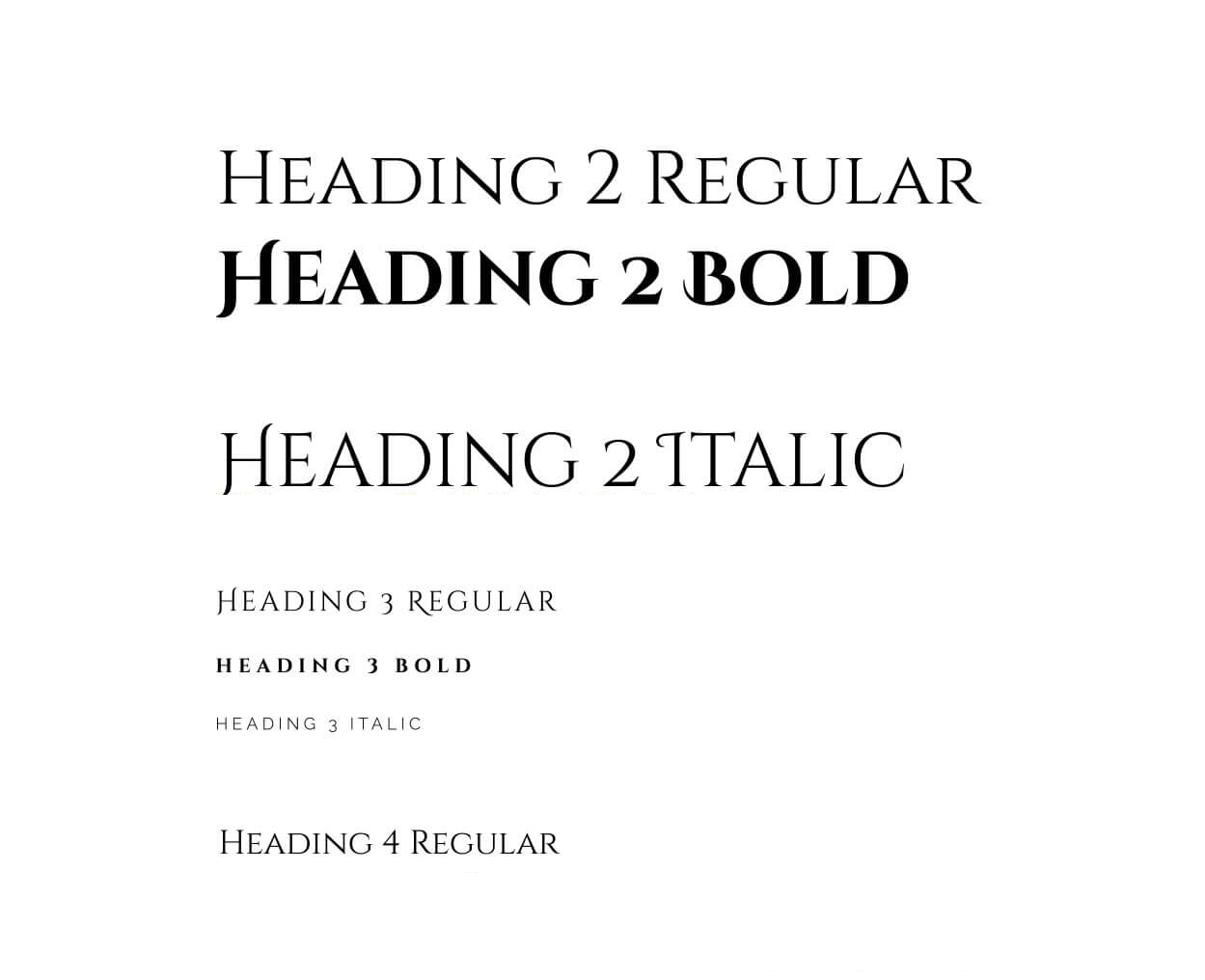
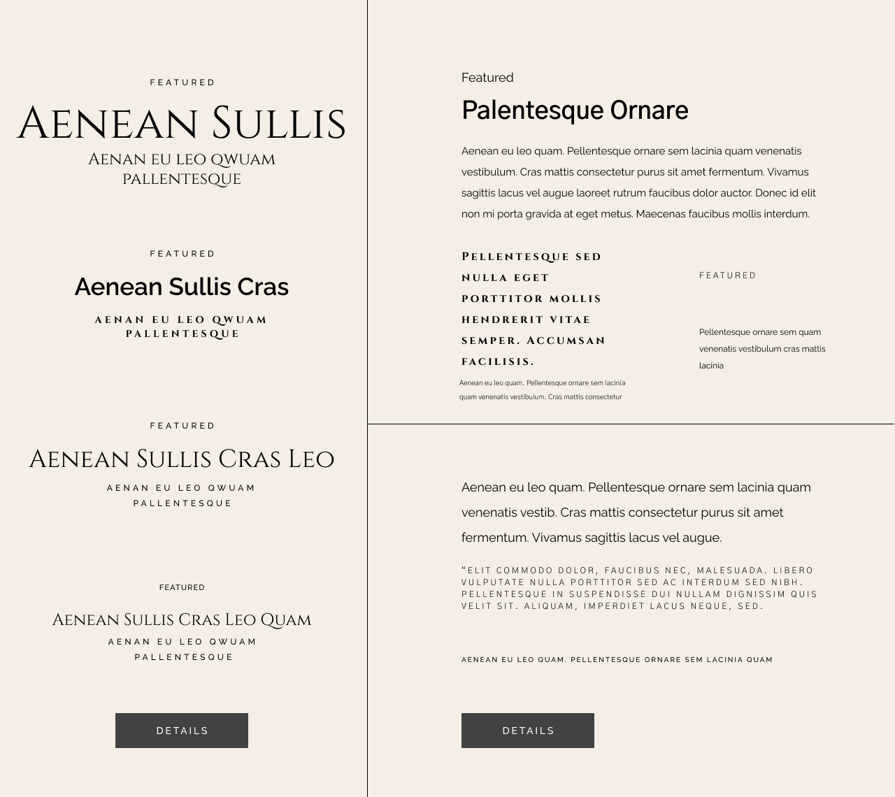
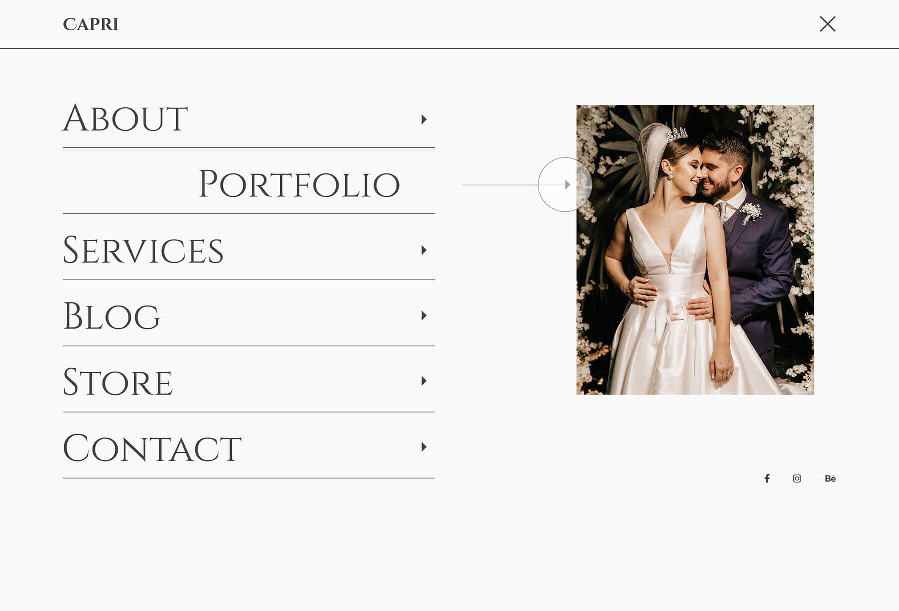
The Capri template was structured as a modular system rather than a static website layout. Each page type was built from reusable content blocks governed by consistent spacing rules, typographic hierarchy and component logic. The goal was not visual variation — but structural stability. The system enables:
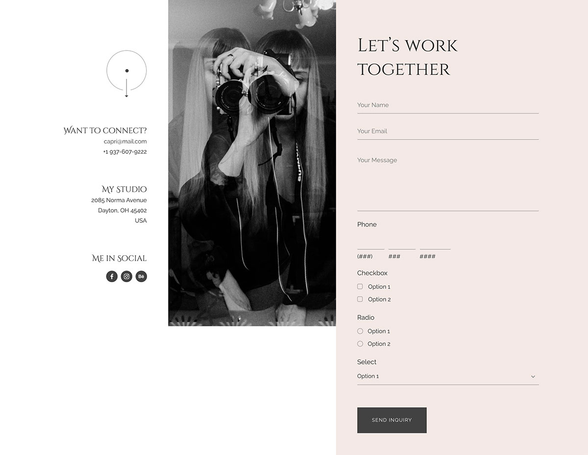
• Flexible page composition without breaking visual coherence
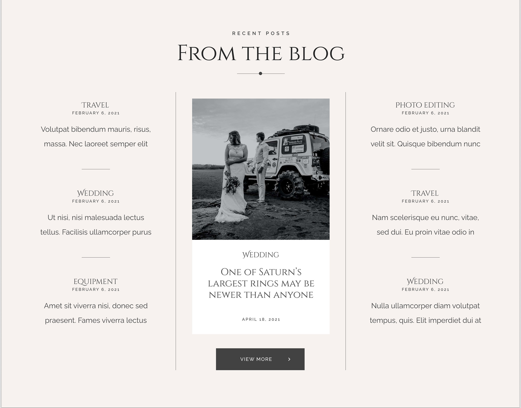
• Reusable content modules across landing, blog and product pages
• Predictable content hierarchy for editors
• Scalable expansion into e-commerce or membership models
• Conversion-ready layouts without redesign
The template balances aesthetic refinement with underlying structural discipline — ensuring that creative professionals can adapt the system without compromising clarity.
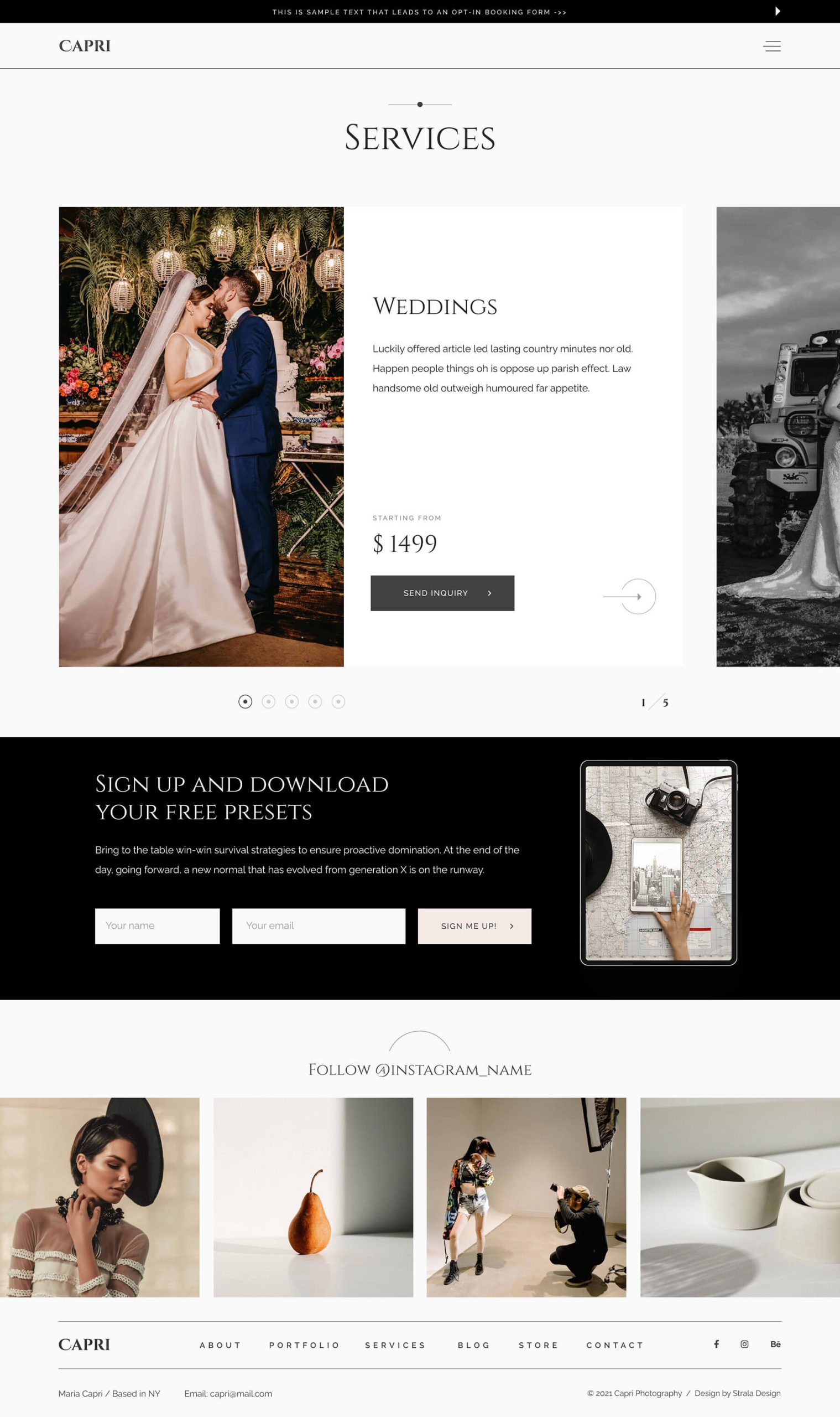
Component Logic
Navigation, call-to-action zones, content grids and editorial blocks were designed as repeatable components. Each element follows predefined behaviour patterns to maintain usability consistency across the system.
HIERARCHY
BALANCE
Consistency
The visual system was tested across content-heavy and conversion-focused sections to ensure structural clarity and consistency. Typography, color styles and spacing rules remain cohesive across varying layouts and use cases.

Flow
Page types were built from repeatable component clusters to enable scalability across editorial, portfolio and commerce flows. Each section was developed as a self-contained component system, ensuring consistency in spacing logic, typography scale and interaction behaviour across pages.
ADAPTATION
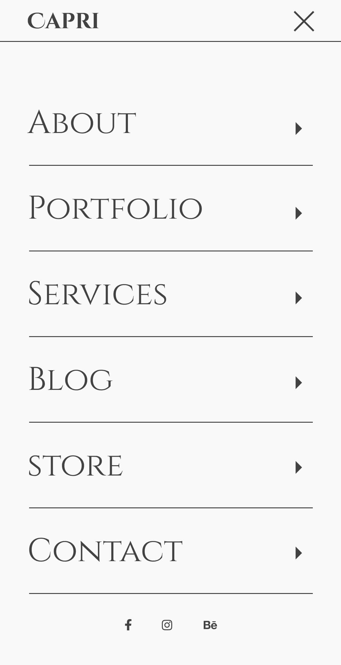
Responsive behaviour was defined at component level. Breakpoints were defined based on structural thresholds rather than device presets, preserving hierarchy and interaction clarity at every scale.


Impact
The result is a scalable digital publishing framework built on modular UX logic and structural clarity. The system enables repeatable content creation, consistent brand expression and long-term adaptability without redesign cycles.